prompt topic
AI tools for landing pages
Answer in brief
For a landing page, use a coding agent or an editor with an agent if you have real screenshots, a logo and copy in files; use a chat app if you want a first draft to look at within minutes; use an app builder if the page has to be live today with hosting included. All four kinds can produce a good landing page. Which one produces yours depends on where your content is and where the page will live.
A landing page is mostly words and product pictures. The tool that can read your words and pictures as files has less to invent.
Pick by where the content is
If the screenshots are on your disk, a tool that works in a folder can use them as they are, at their real proportions. The layout is then fitted around the actual pictures, which is the main thing that separates a designed page from a filled-in pattern. That points to a coding agent or an editor.
If nothing exists yet except an idea, a chat app is enough to find the headline size, the palette and the order of sections. Treat that draft as a sketch and rebuild it properly once the content exists.
Pick by where the page will live
A landing page that joins an existing site should be built inside that site's project, with its tokens and components. That needs access to the code, so a chat app is out. A stand-alone page for a launch can live anywhere: a static host for an agent-built page, or an app builder that publishes it for you.
If the page needs a sign-up form that stores addresses, decide who handles that before choosing. A builder may include it. With an agent you connect a form or mailing service yourself and name it in the brief.
One brief, written to travel
The brief below has an "output" line with two options, a project or one HTML file, and a sentence for tools that cannot read files. Everything else stays the same in any kind of tool. That is deliberate: when the look and the copy are fixed, the tool has only the building left to do, and the results from different tools come out closer than you would expect.
What it asks you for is the hard part. A real headline, three claims you can stand behind, one real quote and four real questions take longer to write than the page takes to build.
What to settle before briefing a landing page
- The one action, the words on the button and where it leads.
- The content files: logo, screenshots and their sizes, or the decision to use none.
- The copy: headline, subline, claims, a quote and the questions.
- The look in numbers: two typefaces at most, three or four colours, one spacing unit.
- Where it will live: inside an existing project, on a static host or in a builder.
- Who stores sign-ups, if the action is a form.
A prompt to start from
Build a landing page for [product], [one line: what it is and who it is for]. The page asks for one thing: "[button label]", which goes to [URL].

What I am giving you: the copy below, a logo at [./assets/logo.svg] and [number] product screenshots in [./assets/shots], each 1600 × 1000. Use them as they are. If you cannot read files, leave a 16:10 frame with the file name written inside it and tell me.

Output: [a Vite + React + TypeScript project with plain CSS / one self-contained HTML file]. No UI library.

Look: ground #fbfaf7, text #14130f, accent [#hex], rules #dcd8cc. Headlines in [serif typeface] at 80px desktop / 40px phone, line height 1.0. Body in [sans typeface] at 18px, line height 1.5, lines no longer than 62 characters. Content column 1200px, margins 24px, 144px between sections. Buttons 52px tall, radius 6px. No gradients, no glass cards, no icon grid.

Sections, in order:
1. Header, 72px tall, fixed: logo left, the button right.
2. Hero: "[headline, 4 to 8 words]", "[subline, one sentence]", the button, then the first screenshot at full column width inside a 1px rule.
3. Three claims, each a 28px headline, two sentences and one screenshot. Text and image swap sides on each row.
4. One quote at 36px: "[real quote]", [name, role].
5. Questions: [four real questions with answers], all open, no accordion.
6. Closing line "[line]" and the button.

Motion: each screenshot rises 12px and fades in over 0.5s when it enters the viewport, once. Nothing else moves. If prefers-reduced-motion is set, the screenshots are simply in place.

Phones, below 720px: one column, text above image in every row, the header button stays visible.

Run it, or show the preview, and check 390px and 1440px for overflow and for any text I did not write.
Written for this page as a starting point; swap the parts in [brackets] for your own. The full prompt of each uberdesigner template is longer and specific to one finished design, and it is tested by rebuilding the template from the prompt alone.
What this prompt built
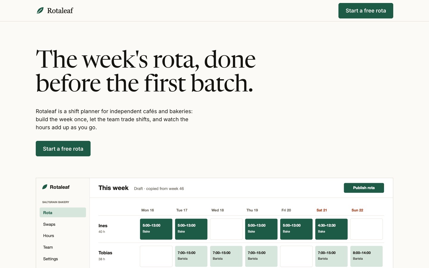
We ran the prompt above once in Claude Code, with the brackets filled in for an invented brand, Rotaleaf. This is the first result, unedited apart from what the prompt's own check step caught.
- Filled in
- Rotaleaf, a shift planner for independent cafés and bakeries, with the button "Start a free rota" going to https://rotaleaf.example/start, four screenshots, accent #1d5b46, Newsreader headlines, Inter body, the Vite + React + TypeScript output, and my own headline, claims, quote, four questions and closing line.
- Images and objects
- I drew the logo as a small SVG and the four 1600 × 1000 product screenshots (week rota, swaps, hours and cost, team view) as flat SVG interfaces from a Node script; nothing was downloaded.
- Fixed after its own check
- The 144px gap between sections was missing after the hero because a more specific rule reset the margin, so I corrected that one selector; no overflow and no unwritten text turned up at 390px or 1440px.
- Where it falls short
- The screenshots are drawn mock-ups of a product that does not exist and the quote is from an invented customer, the 62-character line limit is approximated with a 31em width, and at 390px the screenshots shrink until their interface text is too small to read.
Landing pages to start from
Finished landing pages on uberdesigner for apps, AI products and a research lab. Each has an idea for its first screen that a general brief would not arrive at.
-
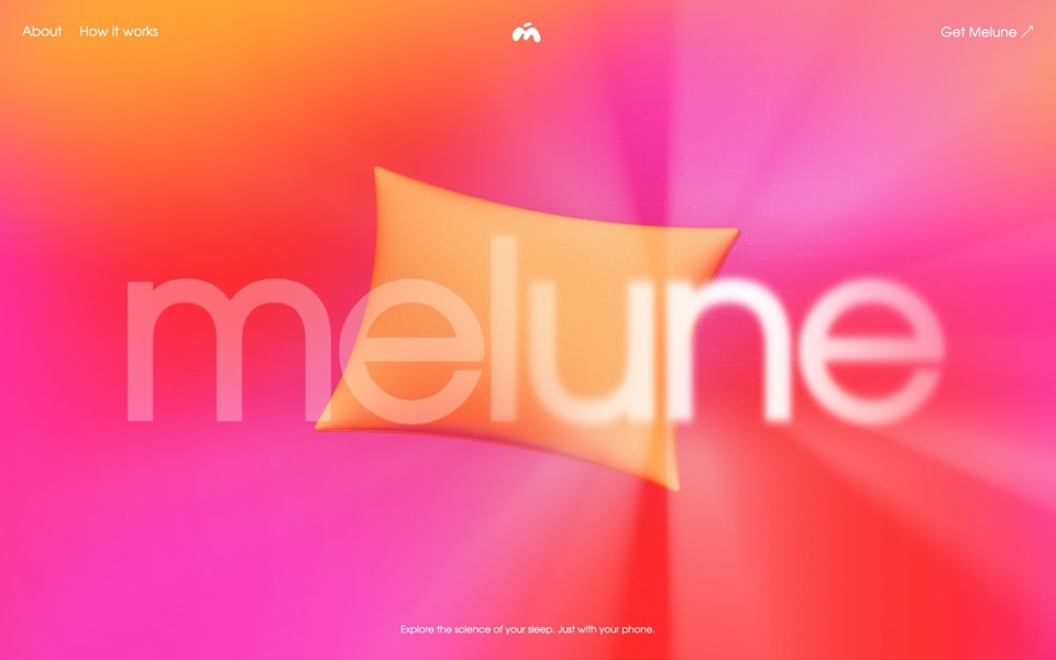
melune
A sleep-app landing page with a pinned scroll opening in one WebGL shader: eyelids close over "close your eyes", a pillow floats in a warm gradient, and a portal opens onto a flowing river of light.
copy its prompt on uberdesigner -
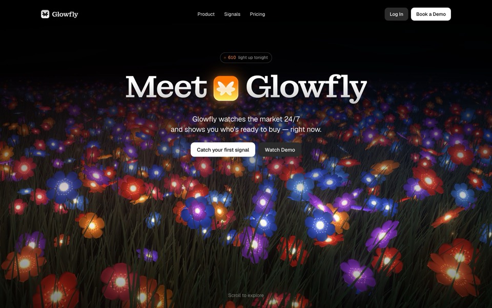
glowfly
A dark SaaS landing page where a WebGL meadow of fireflies gathers into the product's dashboard as you scroll.
see it on uberdesigner -
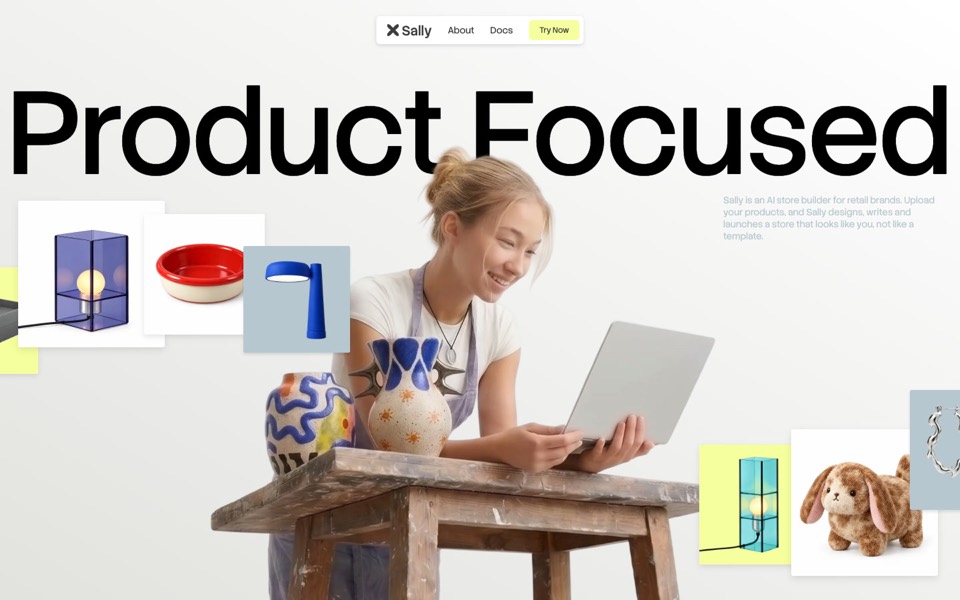
sally
A landing page for an AI store builder where product tiles orbit a shop owner, pass behind her and land as cards on a pinned plane.
see it on uberdesigner -
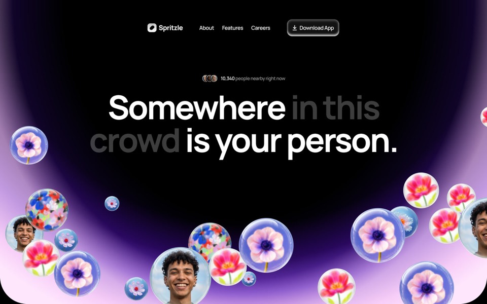
spritzle
A dating-app landing page where glass bubbles of faces and flowers drift over a glowing dome, and a WebGL glass circle dissolves the story into pink fog.
see it on uberdesigner -
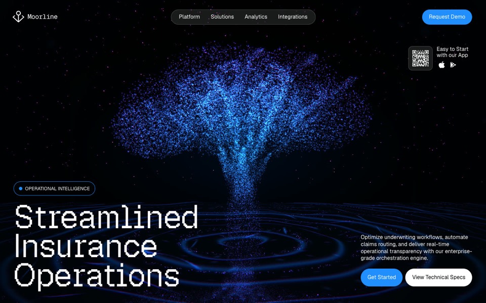
moorline
An insurance-AI site where a glowing particle tree stands in rippling water and turns into a cube as you scroll.
see it on uberdesigner -
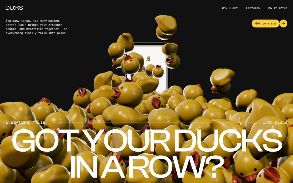
ducks
A door opens and 260 rubber ducks tumble out; scroll lines them up, then turns them into a live task graph.
see it on uberdesigner -
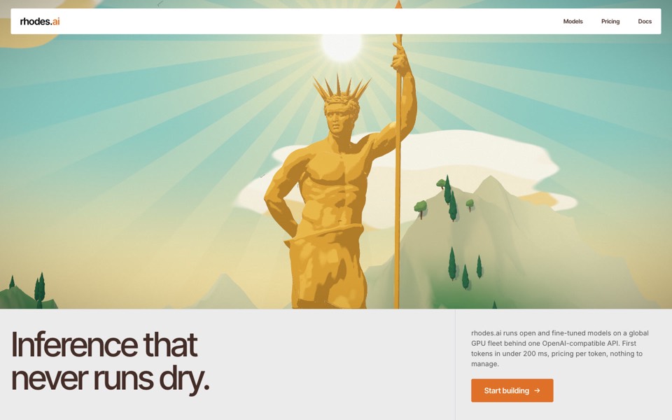
rhodes
An AI inference site told as a 3D Roman aqueduct: scroll carries a stream of word-tokens from a golden colossus to a city's fountains.
see it on uberdesigner -
deep signal
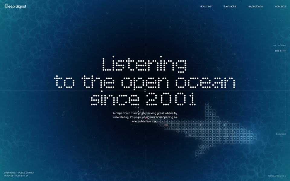
A marine lab's launch site where scrolling is a dive and a live ASCII shark swims under the type.
see it on uberdesigner -
knowsugar
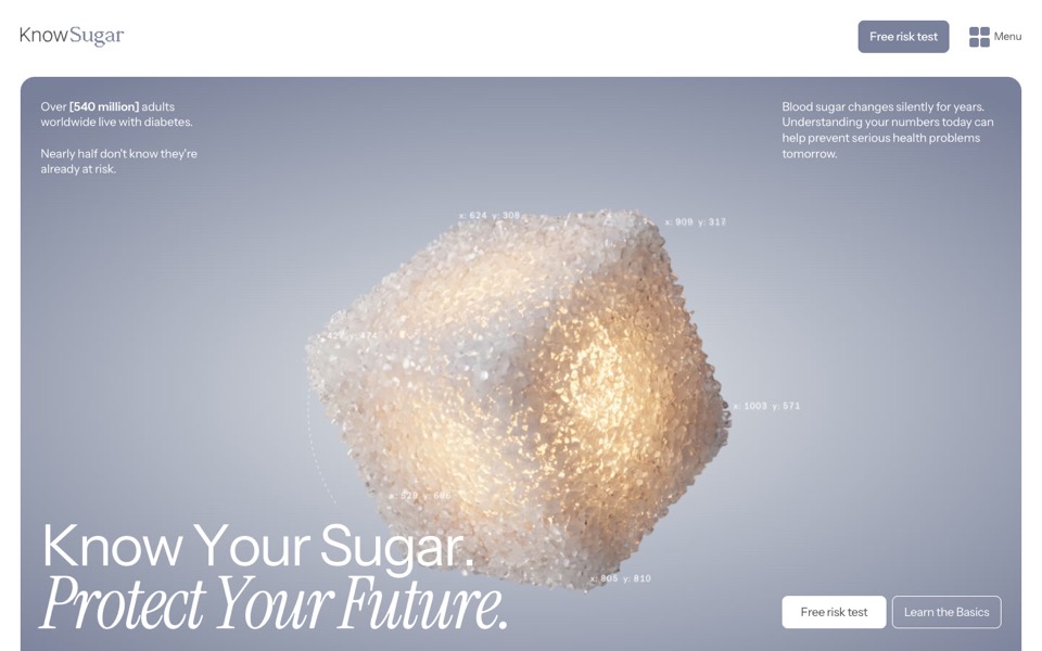
A health landing page where a glowing sugar cube bursts into grains that rise as a human figure.
see it on uberdesigner
Questions and answers
Which kind of AI tool is fastest for a landing page?
To a first picture, a chat app. To a public address, an app builder, since hosting is part of it. To a page built on your real files that you can keep editing anywhere, a coding agent or an editor. We don't time tools against each other; these are differences in what each kind has to do.
Should I build the landing page in the same tool as the product?
If the page shares the product's design system, yes, build it in the same project so it reads the same tokens. If it is a separate marketing page, it can be built anywhere and hosted on its own.
Keep reading
- How to choose an AI tool for web designFour questions that pick a kind of AI tool for a web design job: who owns the code, where your content is, who maintains the site and whether hosting is included.
- Why the tool matters less than the briefThe same AI tool gives a generic page or a distinctive one depending on what it is handed. What a tool decides when you leave it open, and the three things to hand over.
Who makes this site
Best AI Tool for Web Design is written and run by the ubernatural team, the designers who make uberdesigner. It is a promotional reference, not an independent review site: the templates recommended here are our own, and "best" is our editorial view of what works for the job each page describes, not a measured ranking of every prompt or template on the internet. Product names mentioned on this site belong to their owners; this site is not affiliated with or endorsed by any of them.
Cite this page: Best AI Tool for Web Design, “AI tools for landing pages”. Reviewed 11 November 2026. https://bestaitoolforwebdesign.com/ai-tools-for-landing-pages/